Improving the CapMetro App Experience
Location:
Austin, TX
Role:
UX Designer
Year:
2017, 2020
Tools:
Sketch, Figma
Existing Application
When using Capital Metro’s commuter rail to travel Downtown Austin (for SXSW), I decided to download the CapMetro iOS app and use it to purchase my ticket.
While I was able to purchase my ticket, I found the process to be cumbersome and the app to be not very intuitive. This led me to wonder if others felt the same.
Research
I started by talking to people at the rail station, and by checking social media to see what people had been saying about the app.
The app seemed to get mixed reviews. To make sure this wasn’t just confirmation bias and that I was reading real reviews from iOS users, I decided to see how well the app was doing in reviews on the App Store.
The iOS app had 3 out of 5 stars, but only 10 reviews.
The takeaway from the App Store was that there is room for improvement, specifically when it comes to purchasing, activating, and displaying tickets. Public transportation apps in other cities had similar issues.
From here, I decided to see if there were any news articles that discussed the CapMetro app specifically.
I found an article on the Austin American Statesman’s website about a reporter who documented his thoughts while riding CapMetro for a week. Towards the end, he gave his thoughts on the app.
That article received so much feedback, they decided to do a follow up.
A CapMetro employee suggested to the reporter that he use a second app in combination with the CapMetro app.
Some features appear to be well liked by the public, such as the “next departure” feature. The images below are from the articles.
The Problem
With this research, it became clear that there are definitely pain points when it comes to dealing with the app. Users repeatedly point to confusion when it comes to making purchases and locating purchased tickets. I knew that the design solution that I came up with needed to resolve this issue.
Now with a better idea of what people were saying about the app, I decided to see what the business goals of Capital Metro are, and what role the app may or not play in meeting those goals.
Business Needs
Capital Metro hired a planning consultant to study the business, and help set goals. The result was a study they decided to name Connections 2025.
Design
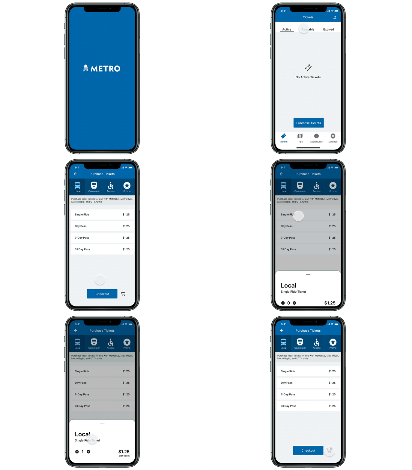
Putting active tickets on the home screen makes them easier to access if needed.
After creating low fidelity wireframes, I annotated the new layout and increased fidelity.
The result was an iOS app that makes it easier for a user to find tickets, and easier to follow the steps to make purchases.
Iteration
After testing and receiving user feedback, I decided to revisit this project and further iterate using Figma. The result is a cleaner look that combines some of the previous categories and is less intimidating which should help increase sales and usage of the application.
Going back to the problem as previously stated, users were confused about the process of purchasing tickets and locating previously purchased tickets when ready to use. The new design simplifies the process of navigating to the Purchase Tickets screen and locating not only active, but also inactive and expired tickets.


